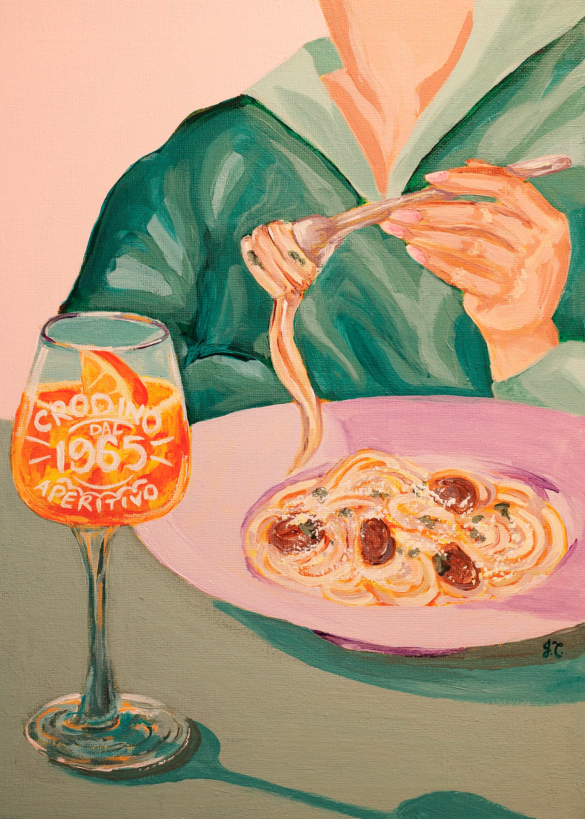
Joeyline Tannous - Pasta and Crodino Print
Price: From €15
"Art has become my refuge to help shut my brain down, balance out my life, and bring me joy"
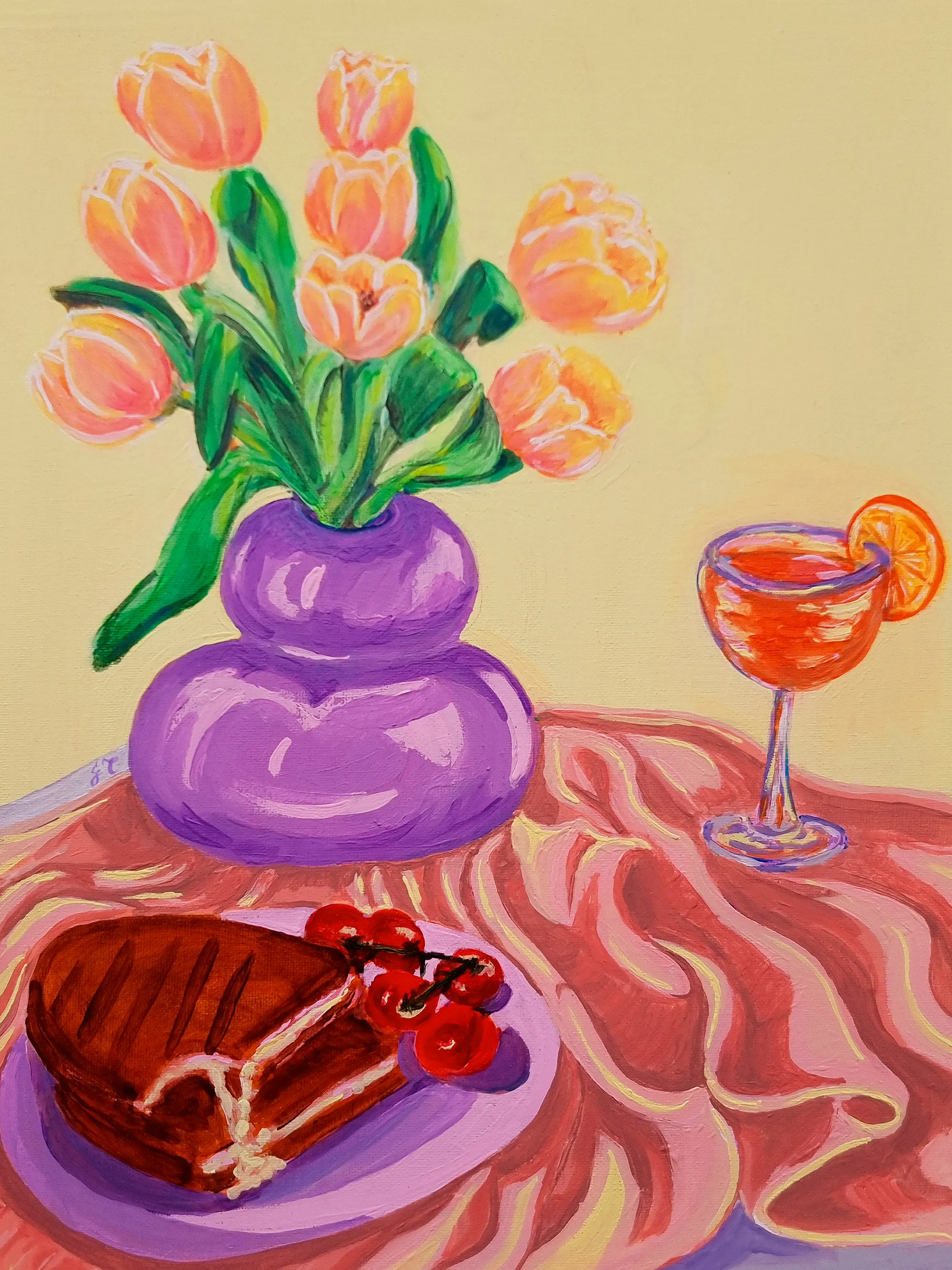
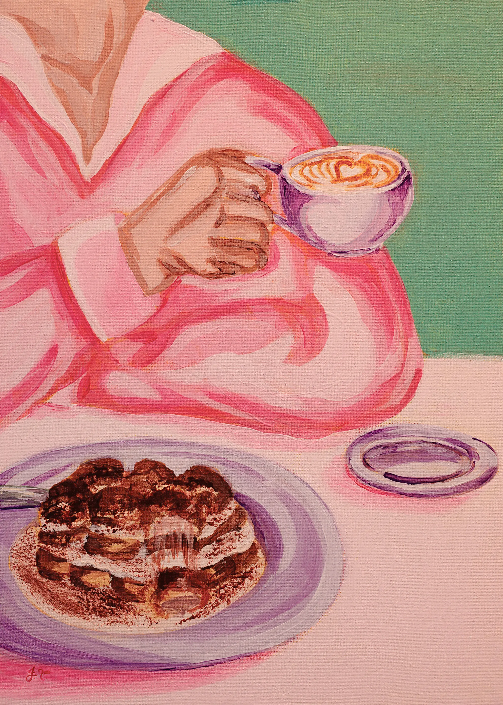
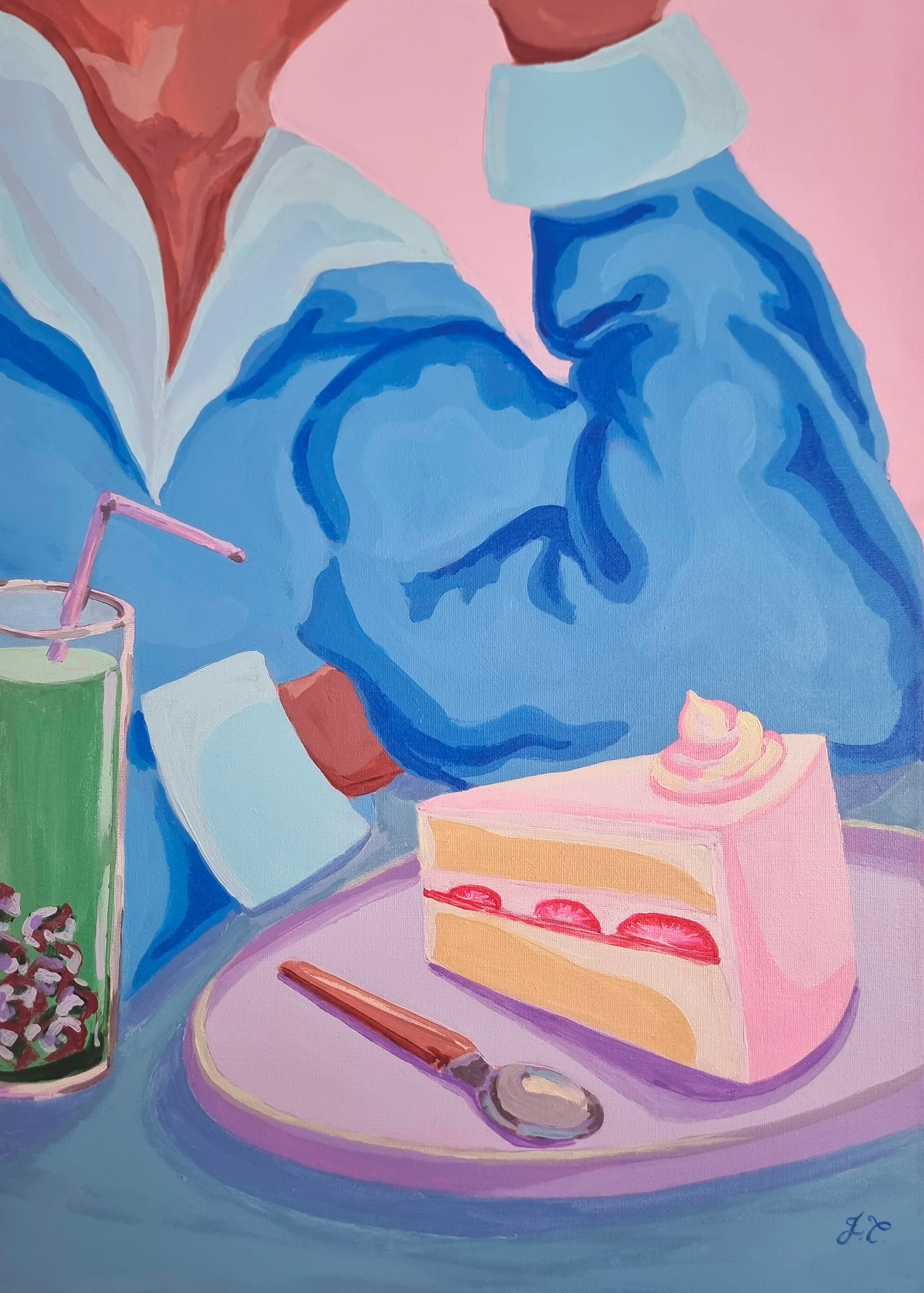
Joeyline Tannous creates intimate, joyful scenes inspired by everyday rituals. Working with expressive colour and loose, painterly forms, she captures scenes with food that invite pause and connection.
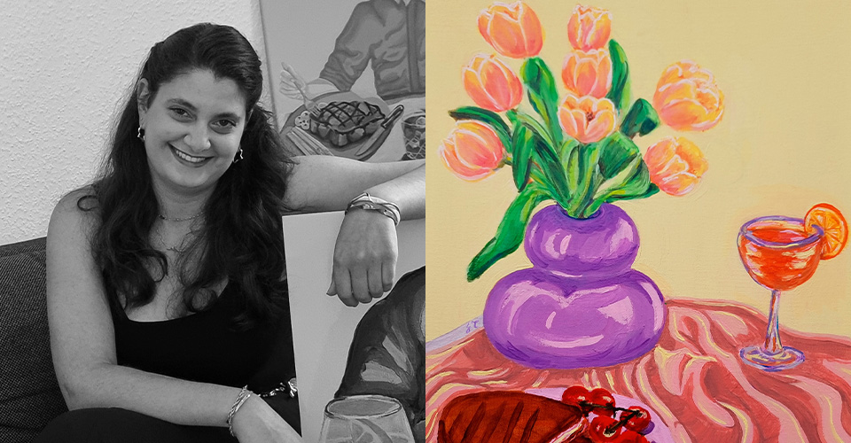
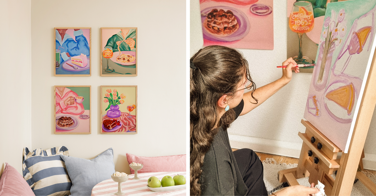
"Joeyline Tannous is awarded for her intimate and characterful depictions of everyday life. Through expressive colour, familiar motifs and a quietly assured sense of composition, she transforms ordinary scenes into works that feel personal, vivid and immediately engaging. The jury was drawn to the warmth of her visual storytelling and to her ability to bring lightness, presence and emotional resonance to the everyday."
Upon winning Illustrator of the Year, Joeyline says:
"It means so much to just be able to be a part of the nominees, let alone to win the category I was in. It gave me the validation that I needed that yes, I am an artist, and I can share my art. It showed me that taking the courage to put myself out there, to try, can lead to incredible results. I needed a sign to prove to myself that this is something I can do, that I can take seriously, and the universe responded tenfold.
Joeyline grew up in a creative household, her mother is a interior architect and designer. "As a child, I always thought her job was just drawing all the time, which sounded like the coolest job ever." Joeyline studied Architecture and snuck into as many drawing classes as possible before graduating. "Sketching became my primary medium to convey my work, concepts, and thought processes as an architect, and later as an urban designer."
Her illustrations often centre around dining. "Food brings people together, be it at cafés or someone's kitchen, and it can always invite conversation. It's a sort of reimagining or merging of classical still life with modern Instagram food posts that use just enough perspective to make sense, but not enough dimension to take itself seriously."
Of her winning pieces she says: "The objective was not to make it a hyper realistic version, but rather somewhat cartoonish with clearly defined edges, which in reality, gave me more freedom to experiment with colour blocking and keeping the imperfections prominent. I want it to look a bit hand-made, and give it character. I also wanted to make sure most colours remain light and playful."
To activate your membership price, enter your email below.
Please read our Privacy Policy on how we process your dataBy entering your email and clicking send you consent to receive marketing, personalised messages, exclusive discounts, tips and tricks, inspiration, behind the scenes, and so much more from us. You can unsubscribe at any time